
Saying that your website forms are one of the most important items on your website design is an understatement. Your forms help visitors and potential future customers to reach out to you, beginning a conversation. They allow you to begin creating and building a relationship with new prospects.
But with so many different plugins and form options, it can hard to figure out which way to go when it comes to the data and questions on your forms. To help, here are the five things you need to remember when creating your website forms.
1. Only ask what’s absolutely necessary
Each field that you add to your website form will affect its conversion rate, so make sure you only ask what you really need. Do you really need to know their telephone number if you will only contact them via email? Do you really need to know their ‘title’ or whether they are Male or Female? Depending on your business you may need to, but you get the point. Always question why and how the information you ask of your users is being used. If it’s something that can be collected down the line, it’s likely best to keep it off of your site forms.
2. Include trust factors
In order for a future client to consider doing business with you, they’ll need to place their trust in you. While it takes time to gain a client’s trust, it begins upon their initial impression of you. To increase your form conversion rates, begin building trust with your website forms. Let users know that you don’t share their information, and/or that your staff will contact them within a certain amount of time because you value their inquiry.
3. Make Your Forms Easy to Scan and Complete
It’s not an algebra test. You want users to give you information about themselves that is readily available in their minds. So make it simple for them to understand your form, identify its purpose, and clearly see what form fields they need to fill out. A quick tip on this is to utilize white space to make it easier to read the field labels on your form.
You can also title your form with a Call to Action. Try not to use something generic like ‘Fill This Form Out’ and instead, use something like ‘Join Our Community’.
4. Order the form logically
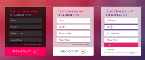
You will want your form fields to be asked logically from a user’s perspective, not just the database. For example, it’s unusual to ask for someone’s address before their name. So your form fields should be along the lines of “Name, Email, Phone Number, and Message.” For longer forms, structure multiple fields by grouping them together in different sub sections or in multi-steps such as: Account details, contact details, payment details, etc;
5. A/B split test everything
Although forms on different sites have a lot in common, it doesn’t mean that copying ESPN’s sign up form will work for your website as well. A/B testing allows you to make tiny changes to your form that will gradually improve its conversion rates. Tests can include altering the action button in text, size and color, making trust factors more prominent, adjusting field positions, or removing optional fields.
Conclusion
Your website forms will act as a Call to Action on your website if properly constructed. Make sure to track your data and A/B test your results to constantly improve your website form conversions. If you’re looking for more information on website design, talk to our Sarasota web design team and get answers to any questions that you may have.
Saying that your website forms are one of the most important items on your website design is an understatement. Your forms help visitors and potential future customers to reach out to you, beginning a conversation. They allow you to begin creating and building a relationship with new prospects.
But with so many different plugins and form options, it can hard to figure out which way to go when it comes to the data and questions on your forms. To help, here are the five things you need to remember when creating your website forms.
1. Only ask what’s absolutely necessary
Each field that you add to your website form will affect its conversion rate, so make sure you only ask what you really need. Do you really need to know their telephone number if you will only contact them via email? Do you really need to know their ‘title’ or whether they are Male or Female? Depending on your business you may need to, but you get the point. Always question why and how the information you ask of your users is being used. If it’s something that can be collected down the line, it’s likely best to keep it off of your site forms.
2. Include trust factors
In order for a future client to consider doing business with you, they’ll need to place their trust in you. While it takes time to gain a client’s trust, it begins upon their initial impression of you. To increase your form conversion rates, begin building trust with your website forms. Let users know that you don’t share their information, and/or that your staff will contact them within a certain amount of time because you value their inquiry.
3. Make Your Forms Easy to Scan and Complete
It’s not an algebra test. You want users to give you information about themselves that is readily available in their minds. So make it simple for them to understand your form, identify its purpose, and clearly see what form fields they need to fill out. A quick tip on this is to utilize white space to make it easier to read the field labels on your form.
You can also title your form with a Call to Action. Try not to use something generic like ‘Fill This Form Out’ and instead, use something like ‘Join Our Community’.
4. Order the form logically
You will want your form fields to be asked logically from a user’s perspective, not just the database. For example, it’s unusual to ask for someone’s address before their name. So your form fields should be along the lines of “Name, Email, Phone Number, and Message.” For longer forms, structure multiple fields by grouping them together in different sub sections or in multi-steps such as: Account details, contact details, payment details, etc;
5. A/B split test everything
Although forms on different sites have a lot in common, it doesn’t mean that copying ESPN’s sign up form will work for your website as well. A/B testing allows you to make tiny changes to your form that will gradually improve its conversion rates. Tests can include altering the action button in text, size and color, making trust factors more prominent, adjusting field positions, or removing optional fields.
Conclusion
Your website forms will act as a Call to Action on your website if properly constructed. Make sure to track your data and A/B test your results to constantly improve your website form conversions. If you’re looking for more information on website design, talk to our Sarasota web design team and get answers to any questions that you may have.