This morning I was searching for a few local service providers and BAM, there it was – A new Google SERP’s page layout. Just as fast as it was there, on my next search a few minutes later, it was gone. Strange?
It’s common for Google to slightly change the layout of the search engine results page (SERP), especially in recent years. From removing lines from links and leaving color, to changing the ‘Ad’ color from yellow to green, or even most recently changing the map listing from 7 down to just 3.
Last year, Search Engine Watch posted an article that noted all of the search results appeared to be in a Card format, similar to the Google Cards you find when using the mobile Google app. This was exactly what I saw today, here in Sarasota.
An excerpt from that article:
It seems Google is once again experimenting with a card-based SERP for desktop, where each result is placed in its own separated box like you would normally see on a mobile search.
However it should be noted that Google has experimented with this card-based layout before. Way back in 2013 it underwent testing, but shortly disappeared soon after. It then appeared again earlier this year in May.
Although neither test led to a roll-out, there’s clearly a reason why it keeps coming back. It does make for a cleaner SERP, with results feeling neater and better organised. And perhaps Google persists with the test because it would make its desktop and mobile UI consistent.
Maybe in a year’s time we’ll know the winner in the battle of ’more space’ vs. ‘cards’. Or maybe we’ll be staring at something completely different…
Personally my fingers are crossed for results appearing one-at-a-time on screen via increasingly elaborate star-wipes.
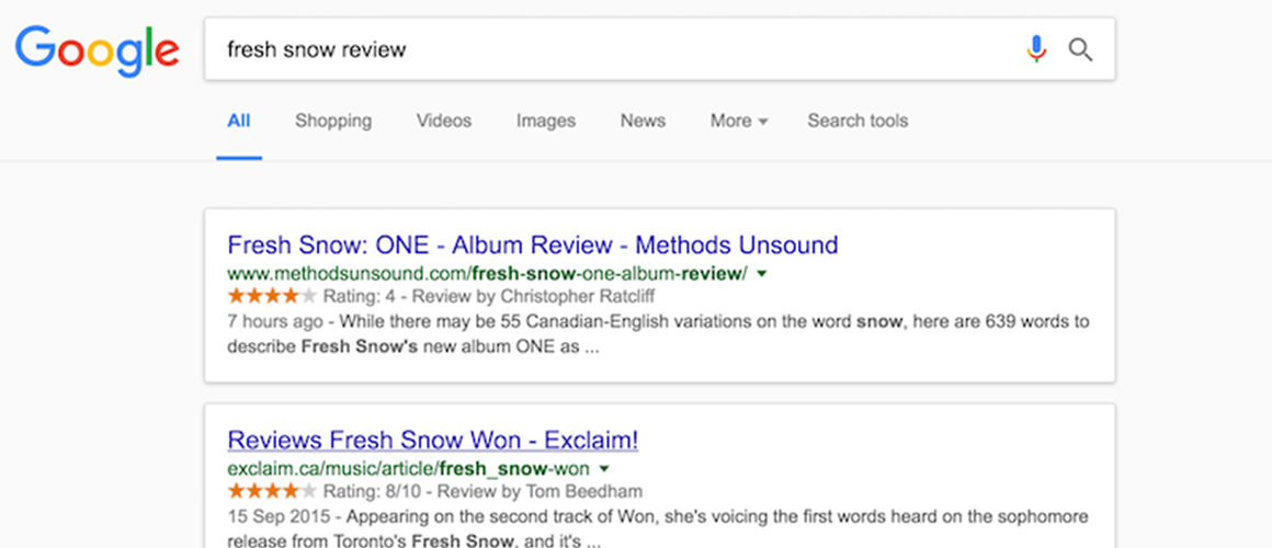
In 2016, the results page looked more like this:
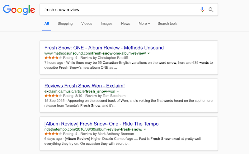
The new Card layout looks like the below screenshot, but who knows how long these will stay out there.
Only time will tell. It’s certain that whichever layout converts the best for Google, they’ll continue to use in the future. What’s curious about this new potential layout is the Snack Pack map, which currently holds three items, but marks the icon of visited website links. So for example, if there have three results and you have recently visited the website of two of these, it will indicate it on the icon in the map. And, with that said, will the map continue to show 3 results being that Google is tracking if you have or haven’t recently clicked-through to a results website?
Let me know your thoughts in the comments below or tweet to me to discuss @ChrisIsBald
This morning I was searching for a few local service providers and BAM, there it was – A new Google SERP’s page layout. Just as fast as it was there, on my next search a few minutes later, it was gone. Strange?
It’s common for Google to slightly change the layout of the search engine results page (SERP), especially in recent years. From removing lines from links and leaving color, to changing the ‘Ad’ color from yellow to green, or even most recently changing the map listing from 7 down to just 3.
Last year, Search Engine Watch posted an article that noted all of the search results appeared to be in a Card format, similar to the Google Cards you find when using the mobile Google app. This was exactly what I saw today, here in Sarasota.
An excerpt from that article:
It seems Google is once again experimenting with a card-based SERP for desktop, where each result is placed in its own separated box like you would normally see on a mobile search.
However it should be noted that Google has experimented with this card-based layout before. Way back in 2013 it underwent testing, but shortly disappeared soon after. It then appeared again earlier this year in May.
Although neither test led to a roll-out, there’s clearly a reason why it keeps coming back. It does make for a cleaner SERP, with results feeling neater and better organised. And perhaps Google persists with the test because it would make its desktop and mobile UI consistent.
Maybe in a year’s time we’ll know the winner in the battle of ’more space’ vs. ‘cards’. Or maybe we’ll be staring at something completely different…
Personally my fingers are crossed for results appearing one-at-a-time on screen via increasingly elaborate star-wipes.
In 2016, the results page looked more like this:
The new Card layout looks like the below screenshot, but who knows how long these will stay out there.
Only time will tell. It’s certain that whichever layout converts the best for Google, they’ll continue to use in the future. What’s curious about this new potential layout is the Snack Pack map, which currently holds three items, but marks the icon of visited website links. So for example, if there have three results and you have recently visited the website of two of these, it will indicate it on the icon in the map. And, with that said, will the map continue to show 3 results being that Google is tracking if you have or haven’t recently clicked-through to a results website?
Let me know your thoughts in the comments below or tweet to me to discuss @ChrisIsBald