2017 is upon us and that means for many website owners, it’s time to take a serious look at your site and what changes might need to be made in order to keep in updated and modern. If you’re wondering what website design trends might be popular during the next year, here are some of the biggest to look out for in 2017:
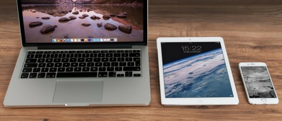
Mobile first adoption
Sure, there are still plenty of people who still use desktop and laptop computers, but more and more people are switching over to mobile devices as their primary web surfing tool. It’s usually more convenient and, in many ways, much faster than having to turn on, boot up, and use even the fastest computer. As mobile networks become faster and the devices themselves more powerful, we are likely going to continue to see a shift to mobile devices and see more and more need for websites that are optimized for mobile first and then for larger devices. An emphasis on not just design, but also content that is more mobile friendly will be more and more popular in 2017.

Responsive design emphasis
Responsive design has obviously been important for the last few years, taking over every corner of the website design marketplace. But in 2017, as there continues to be a very heavy focus on mobile devices for consumers, responsive design is only going to continue to be more important. Consumers are going to expect to have the exact same experience whether they access your website from a smartphone, a table, or a wide-screen desktop. Making sure that your website provides this experience, through responsive design, is going to be integral to engaging with consumers in 2017.
Larger type
We are already seeing a trend towards larger type in website design right now and it probably only going to continue over the next year. The larger the type is and the more engaging the copy that is in that type is, the better your website is going to perform. Of course, you cannot just set all of your text in huge type and expect that website to succeed. Instead, you need to focus on short snippets of powerful content that should be in large type so they grab the attention of the reader as quickly as possible. The type size should match the boldness of the statement itself.
New layouts
Up until now most websites were basically the same. They have the name of the website across the top and content down below. This year, we are likely to see innovation in the world of layouts, with more and more experimental layouts finding their way into the mainstream. Whether this is just a tilted layout that puts more emphasis on color and form or whether it is the utilization of a grid to highlight different types of content in a uniform way. Consumers are going to continually look for more and more interesting and unique designs.
More color
 In the past few years, we have seen the color largely be sapped out of the internet. We started to prefer more muted palettes, which appeared more modern. Color is now returning to the internet. You’re probably already seeing some companies leave behind their flat black and white designs for bigger and more colorful designs. Take a look at Asana and Instagram for examples of color returning to previously flat designs.
Animation
Animation was something you added to your website in your 8th grade web design class because you thought it was funny. It quickly become apparent that no professional website had anything that would move unless the user asked it to move. Animation is now returning into the website design meta, with more and more businesses asking designers to create engaging and fun animations that will draw the attention of users who find their websites. They are far more refined than what was previously popular in design, becoming a part of the website instead of something that is simply laid on top of it.
Focus on conversation
 More and more websites are creating a space for their visitors to talk to them or, at the very least, making it very easy to be directed back to a social media account where they can talk to that company. It is becoming more and more important for websites to be able to actively interact with the people that come to those websites. There are going to be design choices that will encourage interaction and conversation and some that will push it away. Many websites will even put an emphasis on personalization for certain users, keeping a log of what they have looked at and used before to serve up content that they are more likely to look at and use in the future.
Humanization
Consumers are getting tired of interacting just with computer. They want to know the human, not just the robotic face of a company or brand. This will make it even more important that your website’s design has an emphasis on humanization and not just on presenting information about your business/brand. This might include more human branding (which will necessitate better design) and more videos and pictures that show the real humans behind the website.
2017 is upon us and that means for many website owners, it’s time to take a serious look at your site and what changes might need to be made in order to keep in updated and modern. If you’re wondering what website design trends might be popular during the next year, here are some of the biggest to look out for in 2017:
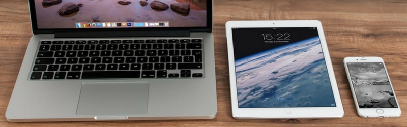
Mobile first adoption
Sure, there are still plenty of people who still use desktop and laptop computers, but more and more people are switching over to mobile devices as their primary web surfing tool. It’s usually more convenient and, in many ways, much faster than having to turn on, boot up, and use even the fastest computer. As mobile networks become faster and the devices themselves more powerful, we are likely going to continue to see a shift to mobile devices and see more and more need for websites that are optimized for mobile first and then for larger devices. An emphasis on not just design, but also content that is more mobile friendly will be more and more popular in 2017.
Responsive design emphasis
Responsive design has obviously been important for the last few years, taking over every corner of the website design marketplace. But in 2017, as there continues to be a very heavy focus on mobile devices for consumers, responsive design is only going to continue to be more important. Consumers are going to expect to have the exact same experience whether they access your website from a smartphone, a table, or a wide-screen desktop. Making sure that your website provides this experience, through responsive design, is going to be integral to engaging with consumers in 2017.
Larger type
We are already seeing a trend towards larger type in website design right now and it probably only going to continue over the next year. The larger the type is and the more engaging the copy that is in that type is, the better your website is going to perform. Of course, you cannot just set all of your text in huge type and expect that website to succeed. Instead, you need to focus on short snippets of powerful content that should be in large type so they grab the attention of the reader as quickly as possible. The type size should match the boldness of the statement itself.
New layouts
Up until now most websites were basically the same. They have the name of the website across the top and content down below. This year, we are likely to see innovation in the world of layouts, with more and more experimental layouts finding their way into the mainstream. Whether this is just a tilted layout that puts more emphasis on color and form or whether it is the utilization of a grid to highlight different types of content in a uniform way. Consumers are going to continually look for more and more interesting and unique designs.
More color
In the past few years, we have seen the color largely be sapped out of the internet. We started to prefer more muted palettes, which appeared more modern. Color is now returning to the internet. You’re probably already seeing some companies leave behind their flat black and white designs for bigger and more colorful designs. Take a look at Asana and Instagram for examples of color returning to previously flat designs.
Animation
Animation was something you added to your website in your 8th grade web design class because you thought it was funny. It quickly become apparent that no professional website had anything that would move unless the user asked it to move. Animation is now returning into the website design meta, with more and more businesses asking designers to create engaging and fun animations that will draw the attention of users who find their websites. They are far more refined than what was previously popular in design, becoming a part of the website instead of something that is simply laid on top of it.
Focus on conversation
More and more websites are creating a space for their visitors to talk to them or, at the very least, making it very easy to be directed back to a social media account where they can talk to that company. It is becoming more and more important for websites to be able to actively interact with the people that come to those websites. There are going to be design choices that will encourage interaction and conversation and some that will push it away. Many websites will even put an emphasis on personalization for certain users, keeping a log of what they have looked at and used before to serve up content that they are more likely to look at and use in the future.
Humanization
Consumers are getting tired of interacting just with computer. They want to know the human, not just the robotic face of a company or brand. This will make it even more important that your website’s design has an emphasis on humanization and not just on presenting information about your business/brand. This might include more human branding (which will necessitate better design) and more videos and pictures that show the real humans behind the website.