Welcome back! Olivia, here (:
Are you looking for some inspiration to use in an attempt to revive your Facebook with a sweet cover photo? Well look no further! Here are some of my favorite businesses’ Facebook cover photos with all the details into why they’re the best:
Chipotle

We all know about Chipotle, right? Well just like their delicious food, they also have a Facebook cover that makes your mouth water! Chipotle’s cover photo definitely expresses what the brand is about- fresh, wholesome indigents with no hidden agenda. With the use of fresh ingredients on a stained concrete backdrop, the viewer is drawn to look closer, with a sudden craving for tacos soon to arise!
Coca Cola

Coca Cola does a great job with their cover! Not only does it tell a story, but their label is firmly placed in the forefront of the image and shows a scene unfolding behind it. This cover photo is what marketing is all about- showing people the emotion they will experience by purchasing their product. Props to you, Coke!
Shaaanxo (Shannon Harris)

Shaaanxo, the uber popular YouTuber and Entrepreneur from New Zealand, has a one-of-a-kind Facebook cover photo! Her cover features a headshot, followed by her YouTube URL and the days and times she posts her videos. Sure, the cover is pretty, but it hosts two great marketing strategies: showing viewers who you are and exactly where to find you.
Tanner, Mainstain, Glynn & Johnson LLP

Tanner, Mainstain, Glynn & Johnson LLP is a Public Accounting firm. Now, I know what you may be thinking: “how could a PA firm’s Facebook photo be awesome?” Well, I’m happy you asked! Instead of the stuffy staff photo followed by their contact info, they chose to go a different route by using a photo that showed more of what they do, rather than who they are. By using the photo of a man looking at information and trying to solve it, it shows the viewer that this is what they will do with their clients and provides a level of trust. I’d give this cover photo a 5/5 stars!
HubSpot

As I was looking up other company’s Facebook cover photos, I decided to check out HubSpot’s page. If you haven’t heard of them before, HubSpot is a popular marketing firm that is considered an Industry Leader for those who work/are interested in digital marketing. I definitely had high hopes for their Facebook, seeing as they are a digital marketing firm, and I was greeted with a comical photo of two cartoon characters talking about HubSpot’s new initiative. This photo I great and not only markets their new focus, but also gives viewers a taste of their voice and company culture.
Yes To Carrots
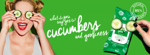
Yes To Carrots is a popular all-natural beauty brand that focus on the goodness that natural ingredients provide and their cover photo really reflects that! Not only is the cover photo bright and inviting, but it markets their newest product and engages the potential customer by asking them a question- “what do you say yes to?” Love this cover banner!
Nando’s
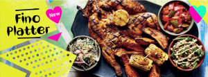
Annnnddd we’re back to food! Okay, so quick crash course: Nando’s is a SUPER popular English fast-food joint that has the nation wrapped around it’s finger. Everyone’s eaten there and a few celebs, including Ed Sheeran, even have Nando’s Black Cards that gets them free food every time! Now that we’ve got that out of the way, you’re probably expecting a pretty jammin’ cover photo, right? Nando’s cover photo features the name of their new dish and shows you what you can expect to get when you order it. Great marketing, am I right?
ColourPop Cosmetics
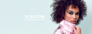
Colour Pop has made waves in recent years for its great formulas with affordable price tags. As used by some of beauty’s top influencers, Colour Pop definitely knows how to market their products well! I personally love Colour Pop’s Facebook header because it shows you what the products they make actually look like, rather than just a pretty arrangement of random eyeshadows and lipsticks. Not only does their banner show you what they sell, it tells you what’s in style- once again, a great tactic. By using the “In Bloom” quote, it signals to readers that the colors and styles the model is wearing are what to look out for during the Spring/Summer seasons and shows the potential customer how good they can look if they purchase the same products.
Hopeless Records

In a quest for the best Facebook Banners, I came across Hopeless Record’s super sweet set up! Now, you might now know of this label off of the top of your head, like me, but by looking at their banner, they’ve got it goin’ on. Hopeless Record’s Facebook banner uses a mix of gradient photos with an all-black-and-white theme that extends into their company logo. For a label I’ve never heard of, I became suddenly interested in finding out more about them just after looking at their banner! Talk about an interest piece! If you take away anything from this company’s marketing, understand the value of a solid introduction- meaning, give potential viewers, customers, etc., something to get excited about so that they will take a closer look.
Magnolia Homes
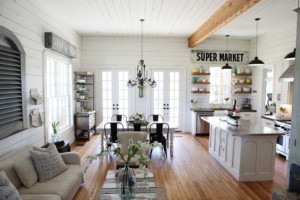
Dynamic Duo Chip and Joanna Gaines have basically become a household name in the last couple of years with their popular HGTV show, Fixer Upper. As Chip and “Jo” have been in the home business for a while now, I found myself checking their Facebook page to see what their cover photo looked line, since their designs are so amazing on TV. Thankfully, their banner impressed! I’m sure others are looking for the same thing I was when I click on the Magnolia Homes Facebook Page, so the duo decided to just use a photo from their own home and let it speak for itself. The simple, clean and streamline picture sums up what their company is about and also allows visitors to peek inside their personal lives, with the photo being of inside their own home.
Welcome back! Olivia, here (:
Are you looking for some inspiration to use in an attempt to revive your Facebook with a sweet cover photo? Well look no further! Here are some of my favorite businesses’ Facebook cover photos with all the details into why they’re the best:
Chipotle

We all know about Chipotle, right? Well just like their delicious food, they also have a Facebook cover that makes your mouth water! Chipotle’s cover photo definitely expresses what the brand is about- fresh, wholesome indigents with no hidden agenda. With the use of fresh ingredients on a stained concrete backdrop, the viewer is drawn to look closer, with a sudden craving for tacos soon to arise!
Coca Cola

Coca Cola does a great job with their cover! Not only does it tell a story, but their label is firmly placed in the forefront of the image and shows a scene unfolding behind it. This cover photo is what marketing is all about- showing people the emotion they will experience by purchasing their product. Props to you, Coke!
Shaaanxo (Shannon Harris)

Shaaanxo, the uber popular YouTuber and Entrepreneur from New Zealand, has a one-of-a-kind Facebook cover photo! Her cover features a headshot, followed by her YouTube URL and the days and times she posts her videos. Sure, the cover is pretty, but it hosts two great marketing strategies: showing viewers who you are and exactly where to find you.
Tanner, Mainstain, Glynn & Johnson LLP

Tanner, Mainstain, Glynn & Johnson LLP is a Public Accounting firm. Now, I know what you may be thinking: “how could a PA firm’s Facebook photo be awesome?” Well, I’m happy you asked! Instead of the stuffy staff photo followed by their contact info, they chose to go a different route by using a photo that showed more of what they do, rather than who they are. By using the photo of a man looking at information and trying to solve it, it shows the viewer that this is what they will do with their clients and provides a level of trust. I’d give this cover photo a 5/5 stars!
HubSpot

As I was looking up other company’s Facebook cover photos, I decided to check out HubSpot’s page. If you haven’t heard of them before, HubSpot is a popular marketing firm that is considered an Industry Leader for those who work/are interested in digital marketing. I definitely had high hopes for their Facebook, seeing as they are a digital marketing firm, and I was greeted with a comical photo of two cartoon characters talking about HubSpot’s new initiative. This photo I great and not only markets their new focus, but also gives viewers a taste of their voice and company culture.
Yes To Carrots

Yes To Carrots is a popular all-natural beauty brand that focus on the goodness that natural ingredients provide and their cover photo really reflects that! Not only is the cover photo bright and inviting, but it markets their newest product and engages the potential customer by asking them a question- “what do you say yes to?” Love this cover banner!
Nando’s

Annnnddd we’re back to food! Okay, so quick crash course: Nando’s is a SUPER popular English fast-food joint that has the nation wrapped around it’s finger. Everyone’s eaten there and a few celebs, including Ed Sheeran, even have Nando’s Black Cards that gets them free food every time! Now that we’ve got that out of the way, you’re probably expecting a pretty jammin’ cover photo, right? Nando’s cover photo features the name of their new dish and shows you what you can expect to get when you order it. Great marketing, am I right?
ColourPop Cosmetics

Colour Pop has made waves in recent years for its great formulas with affordable price tags. As used by some of beauty’s top influencers, Colour Pop definitely knows how to market their products well! I personally love Colour Pop’s Facebook header because it shows you what the products they make actually look like, rather than just a pretty arrangement of random eyeshadows and lipsticks. Not only does their banner show you what they sell, it tells you what’s in style- once again, a great tactic. By using the “In Bloom” quote, it signals to readers that the colors and styles the model is wearing are what to look out for during the Spring/Summer seasons and shows the potential customer how good they can look if they purchase the same products.
Hopeless Records

In a quest for the best Facebook Banners, I came across Hopeless Record’s super sweet set up! Now, you might now know of this label off of the top of your head, like me, but by looking at their banner, they’ve got it goin’ on. Hopeless Record’s Facebook banner uses a mix of gradient photos with an all-black-and-white theme that extends into their company logo. For a label I’ve never heard of, I became suddenly interested in finding out more about them just after looking at their banner! Talk about an interest piece! If you take away anything from this company’s marketing, understand the value of a solid introduction- meaning, give potential viewers, customers, etc., something to get excited about so that they will take a closer look.
Magnolia Homes

Dynamic Duo Chip and Joanna Gaines have basically become a household name in the last couple of years with their popular HGTV show, Fixer Upper. As Chip and “Jo” have been in the home business for a while now, I found myself checking their Facebook page to see what their cover photo looked line, since their designs are so amazing on TV. Thankfully, their banner impressed! I’m sure others are looking for the same thing I was when I click on the Magnolia Homes Facebook Page, so the duo decided to just use a photo from their own home and let it speak for itself. The simple, clean and streamline picture sums up what their company is about and also allows visitors to peek inside their personal lives, with the photo being of inside their own home.
Published on June 15, 2016

