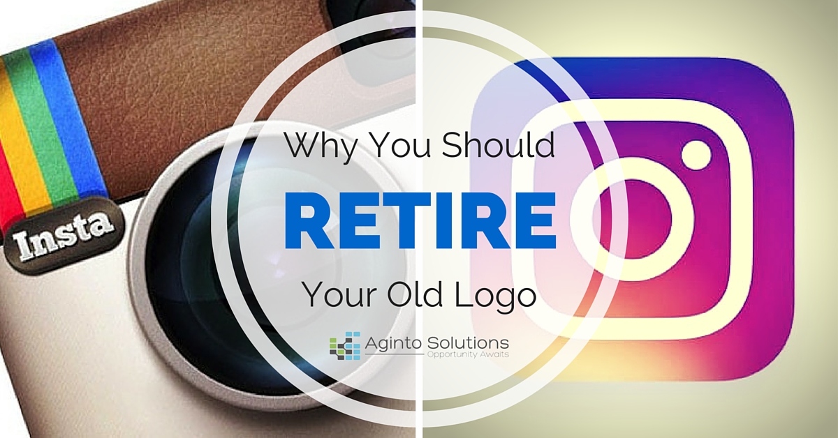
Instagram announced today that they were retiring their well known camera icon logo and replacing it with a new version.

“Brands, logos, and products develop deep connections and associations with people, so you don’t just want to change them for the sake of novelty,” Ian Spalter, Instagram’s head of design, wrote in a blog post on Medium. “But the Instagram logo and design was beginning to feel, well… not reflective of the community, and frankly we thought we could make it better.”
First, what are your thoughts on the new logo and branding? You can watch the reveal in this quick Video released by Instagram:
While we’re still in shock about Instagram’s drastically different new look, it is about time. The social media giant debuted their leather clad camera icon nearly 4 years ago, and the app itself has just recently passed the 5 year anniversary.
Why You Should Update That Old Logo
A new logo can breathe new life into your business, if that’s what’s needed. The question to first ask is, why? If you’re changing your digital marketing strategy, looking for a different demographic, or offering a different product or service, you should definitely consider a new logo. Or, like in Instagrams case – Maybe your logo has become old and isn’t reflective of your the audience you’re appealing to currently.
It’s been our experience in the past, that if you are going to give your logo an overhaul, then keeping key elements of the old logo, while simplifying the look is your best way to go. Many believe that this is a large reason as to why the 2010 Gap logo update didn’t work out as planned. Your customers can get attached to images, and if you stray too far from the original design, and you may end up with a riot on your hands.
But, don’t take my word for it. Here are some logo rebrands that have been noted as being good ideas. Each new design springs from elements found in the old design. Take a look at each and see how they compare with their old counterparts.


A good logo is critical for a successful business. If your logo looks amateurish, so too will your company be perceived. What logo rebrands have you loved over the years? Share your favorites in the comments below!
Instagram announced today that they were retiring their well known camera icon logo and replacing it with a new version.

“Brands, logos, and products develop deep connections and associations with people, so you don’t just want to change them for the sake of novelty,” Ian Spalter, Instagram’s head of design, wrote in a blog post on Medium. “But the Instagram logo and design was beginning to feel, well… not reflective of the community, and frankly we thought we could make it better.”
First, what are your thoughts on the new logo and branding? You can watch the reveal in this quick Video released by Instagram:
While we’re still in shock about Instagram’s drastically different new look, it is about time. The social media giant debuted their leather clad camera icon nearly 4 years ago, and the app itself has just recently passed the 5 year anniversary.
Why You Should Update That Old Logo
A new logo can breathe new life into your business, if that’s what’s needed. The question to first ask is, why? If you’re changing your digital marketing strategy, looking for a different demographic, or offering a different product or service, you should definitely consider a new logo. Or, like in Instagrams case – Maybe your logo has become old and isn’t reflective of your the audience you’re appealing to currently.
It’s been our experience in the past, that if you are going to give your logo an overhaul, then keeping key elements of the old logo, while simplifying the look is your best way to go. Many believe that this is a large reason as to why the 2010 Gap logo update didn’t work out as planned. Your customers can get attached to images, and if you stray too far from the original design, and you may end up with a riot on your hands.
But, don’t take my word for it. Here are some logo rebrands that have been noted as being good ideas. Each new design springs from elements found in the old design. Take a look at each and see how they compare with their old counterparts.


A good logo is critical for a successful business. If your logo looks amateurish, so too will your company be perceived. What logo rebrands have you loved over the years? Share your favorites in the comments below!
Published on May 11, 2016

